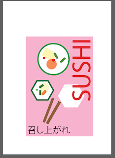
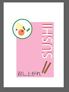
the brand of the sushi by using Illustrator
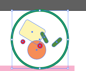
I designed the sushi by using shapes tool including rectangle and circle as i wanted to creat sushi by using all the shapes
The illustration is inspired by this picture in term of ingredients inside the sushi and colour
As you can see sushi includes seaweed (green) and orange ,green and red
source lazycatkitchen
I have made it more simple as less is more.Also, the word sushi is big and appear to be more 3D to capture readers attention. Please feel free to comment your thoughts this piece of work.


I love your use of the shape and colour of the sushi to create the logo. Fabulous. Also, your comments on the colour pink and its place in Japanese culture. However, how do you know these facts about Japanese culture? Where is your research in this regard?
ReplyDelete