The study of different packaging design
This is my second post of the day. After doing some researches, I think the shape of the packaging is another crucial part of the project. I should design packaging which are capturing , modern , and suitable for the product use. In this blog, I have chosen the ideal product which I am interested in.
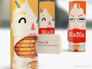
For the first image, I personally like the design of including facial expressions to enhance the appearance. Moreover, I also like the way customer open the box. I can infer from the packaging that it is for children customers the illustration is cartoon.
 For this design, I like the concept of the fruit. I can see that the designer does not include any brand tag or food information on the packaging at all. However, customers can infer the product by just looking at the packaging. Customers can visually infer that the product is relating to the fruits. The colour is also vibrant and colourful.it can attract teenagers and children.
I like this packaging because the box and the bottle have the matching design. The design is realtivelt simple with the use of two colour - red and white which perfectly combined together. It is interesting and classic.
all photos are from the source luerzersarchive
source bittbox
This is my most favourite packaging design as it is simple and it conveys the sense of eco -friendly. The use of colour is earth tone. The use of colour is crucial in presenting the product.The font colour is also minimal which represents kind of expensive and eco-freindly product. Also, the contrast of white and light brown is interesting and minimal. However, if I would like to use this design as a main inspiration, I have to make adjustment to ensure that it is best fit to food packaging. This design is for cosmetic such as lotion.
REFLECTION
After much research , It helps me what kind of design I would love to mainly design something is which is simple and minimal.Also, I should try other approach as well- designing colourful packaging as this is my first major project and I would love to explore numerous approaches.I have learned that colour is crucial as it carries out meaning and it can be the first thing which draw customers attention.


habba babba ??
ReplyDeleteLove these packaging design ideas
ReplyDeleteGreat tips regrading catering packaging. You provided the best information which helps us a lot. Thanks for sharing the wonderful information.
ReplyDeleteshould you ever need packaging design in Malaysia, seek us out! hehe
ReplyDelete